


This poster was a submission in the 21st Bi-Annual Poster & Design Exhibition themed as Osmosis Motif. The exhibition was set up by Dan Mcelhattan III to showcase his student’s work to the Las Vegas design community. In addition, there was a competition to see who’s poster was the best. The judges were made up of people who are established in their profession. This poster won first place in Best in Show and Judge’s Choice.
My design was inspired by the song 'Where this Flower Blooms' by Tyler, The Creator. I felt like promoting the idea of learning from others and investing in yourself. When creating this poster, I wanted to do a mixed media piece; The flowers are images while the girl is an illustration. I hope the viewer feels inspired to continue learning everyday, so they too, can bloom and grow.
An important step for me is to think of related ideas. The theme of the show was named Osmosis Motif, and it was required that the poster was related to it. The final concept was a mix of the things I could think of.
I had decided I wanted to use flowers. My first set of posters were based on my original typography. I picked the petals off some flowers, then put them back together as letterforms.
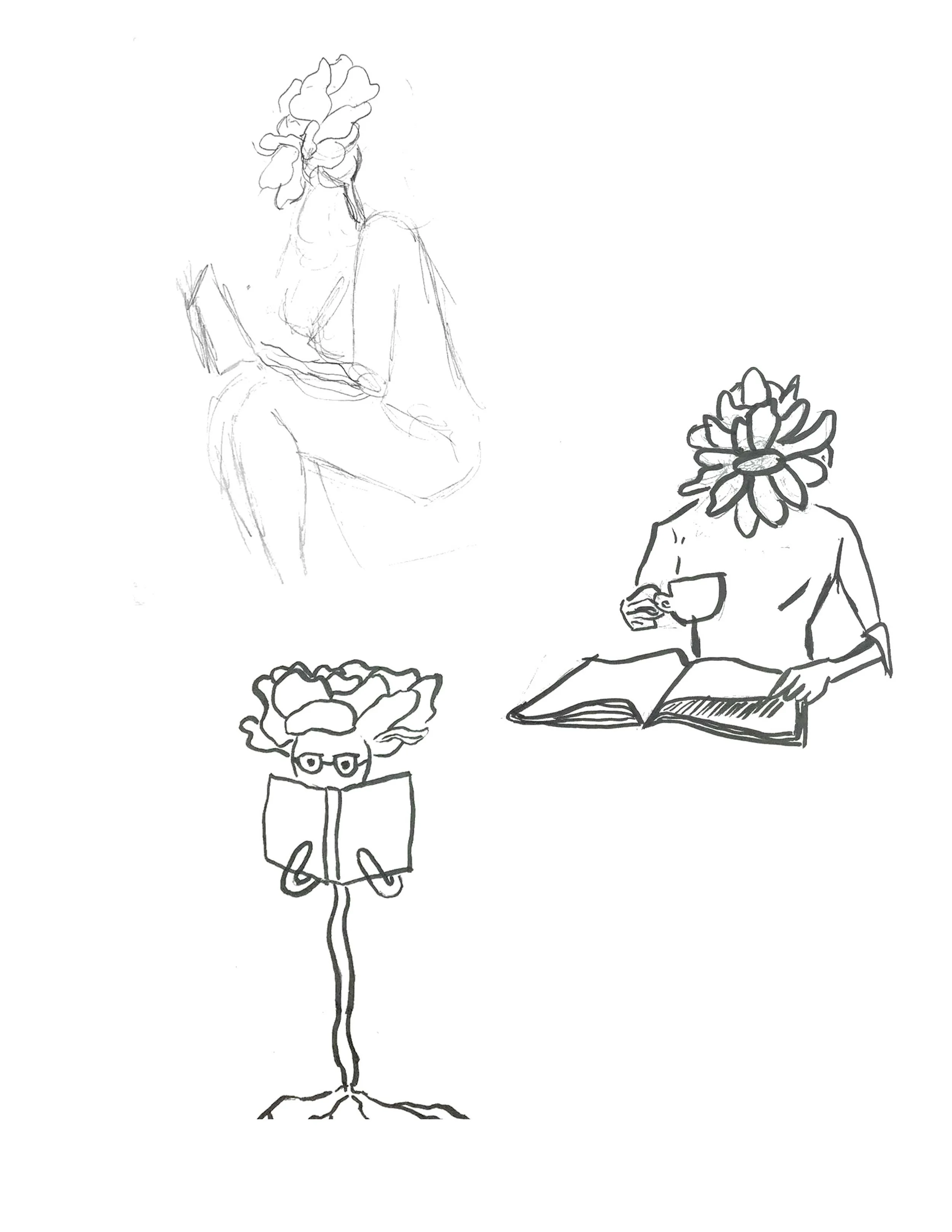
At this point I was liking the idea of having more than just my typography, but I wanted more control of the figure. I decided I’d start sketching some people who had flower heads, and to create a mixed media poster.
Once I got here, I just felt like it needed something to bring some more depth. I added some leafy textures to the illustration, and toned down the green leaves as to not compete with the eye’s attention from the quote.